Various industries have been conquering their domain market on tip of a mobile app. Every day a new technology gets it existence count in the mobile world to make the user experience better than ever. The number of mobile phone users is forecasted to reach 4.77 billion by the end of 2017. This makes mobile responsiveness implementation for any website development one of the most important features. Before responsive and adaptive design methods came into the picture, worldwide top mobile app developers and designers used to prepare different designs even if there is an inch of difference in the mobile device dimensions.
As the responsive design is huge in demand, various top mobile app development companies started making responsive mobile apps and websites that can run on any platform or device. We at BrainMobi have some of the top mobile app developers specialized in creating native, hybrid and cross-platform mobile apps that can run on multiple platforms and devices.
Designing a Responsive Mobile App or a Responsive Website For your Business
Designing a responsive mobile app or a responsive website is not an easy task. It requires rich experience in designing UX and UI and requires out of the box thinking. Well, there are a number of methods to craft mobile apps which instantly detects visitors’ screen size and orientation, then optimize the layout accordingly. Most commonly used approaches used by top app developers are Responsive Design (Multiple Fluid Grid Layouts) and Adaptive Design (Multiple Fixed Width Layouts).
Responsive design is the household term since the time Google launched their mobile friendly algorithm on 21 April 2015. Thereafter implementing the responsive design with a combination of HTML, CSS, and JavaScript to move, shrink, grow, hide and show elements based on the users’ device has been raging trend in the digital spheres. Whereas adaptive design relies on changing the design pattern to fit the real estate available to it then select the layout most appropriate for the screen.
This article helps you to understand the difference between responsive design and adaptive design. You will also get to know why most of the top mobile app development company prefer responsive design over adaptive approach.
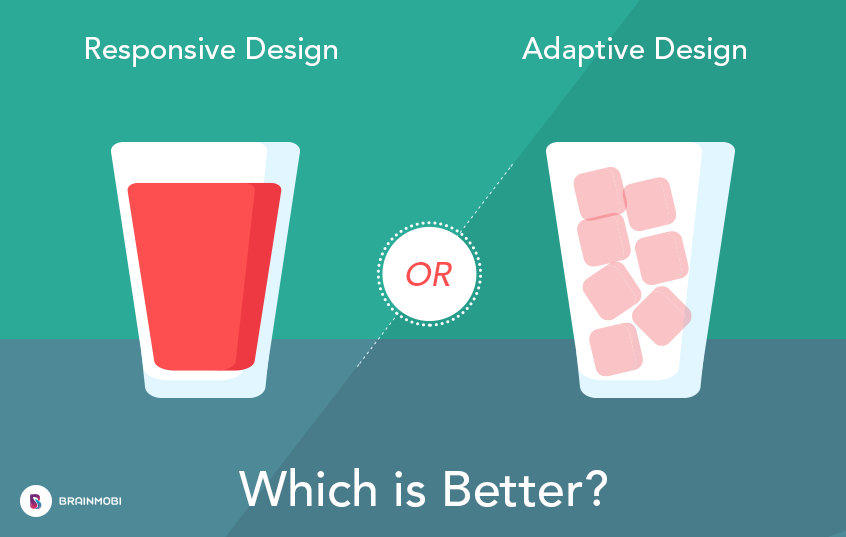
Responsive Design or Adaptive Design – Which is better?
Below are some points that are highlighted by the top mobile app developers which differentiate the two popular design patterns:
| Responsive Design | Adaptive Design |
| Have to create a single design for multiple devices and platforms. | Have to multiple designs for multiple devices and platforms. |
| More user-friendly design layouts but slower in terms of load time. | Less user-friendly design layouts and faster in terms of load time. |
| Uses CSS media queries to change display type, width, height etc. | Uses static layouts to offer tailor-made solutions based on breakpoints. |
| Offers seamless user experience as instantly respond to the hosting device dimensions. | Automatically adjusts and renders correctly to the size of your screen, regardless of which platform or device you’re viewing it from. |
| More cohesive and consistent offers functionality where one design fits all devices and sizes. | Reassures modern user experience with context-based performance and usability. |
These days most of the transactions and sessions are done from mobile only. Having a mobile friendly website will help your site rank higher in the mobile Google searches. More than just exhibiting good layout responsive design also contributes to creating a more cohesive and consistent brand presence across the Internet. Having a single website for several devices and dimensions result to reduced development and maintenance cost. Not only will it benefit you financially in the long run, but it will help you improve your organic conversion rate or sales rate too, which is always the end goal.
According to Google, “users find it easier to get relevant, high-quality search results that are optimized for their devices”. This makes responsive design the “traditional” choice and remains the more popular design approach among top mobile app developers. This is why most of the top responsive mobile app development companies and responsive website design and development companies prefer to develop responsive mobile apps and responsive web design. But adaptive design is also a good option for high budget investment. Google likes websites that load faster, as do users. The choice is yours.
What can BrainMobi do for you?
As we can see that almost every company these days is looking for a change that benefits its internal operations, sales process and departments of management. And we at Brainmobi, have mastered ourselves in turning ideas into reality by creating next-gen mobile apps. We are now one of the leading mobile application development company offering a flexible and cost effective approach to design and develop cutting edge responsive websites and adaptive layouts. Our team of agile developers will help you build your mobile web app and websites from scratch by using the latest tools and industry languages.BrainMobi defines a path for every entrepreneur and startup to turn into a profitable business and achieve maximum ROI rather than having a responsive website or a being a mobile app uploaded on the app store.
If you are interested to know more about responsive and adaptive design reach us today. For a free consultation on redesigning your app and employing the right development practices, Contact Us or drop us a line at – sales@brainmobi.com